Natural disasters represent a major disruptive event for a city’s homeostasis, driving its collective behavior patterns to change. While they are in all cases with regretful consequences, they are also motors for the emergence of cooperation and non-central coordination which directly impacts their resilience. In recent years social media data has been used to assess damage by natural disasters as well a a central part of social coordination. Here we present a study of the latest major earthquake in Mexico City (September 19 2017) using data from multiple sources in order to gain insights in the immediate effects and the collective memory, finding that physical resilience (mobility patterns) is higher than the emotional (social media) by returning to average mobility patterns within two weeks while still on the collective memory for almost a year.
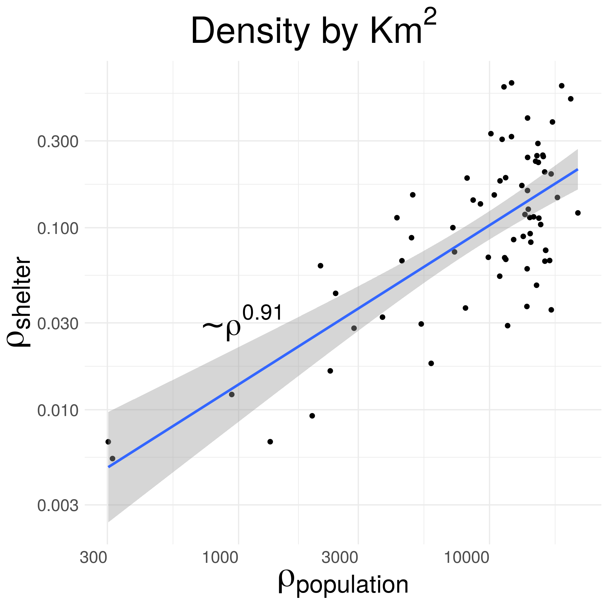
The official damages data set collected by The Federal Government through it’s Open Data Agency contains records of damaged and collapsed buildings as well as the civil response given by shelter allocation with information of the 74 of them across Mexico City. With that information we built a map of Mexico City divided by Voronoi polygons that represent the area where a particular shelter is the closest, and measure how the shelter’s density, given by the inverse of each cell area, scales with the population and damaged buildings densities in order to asses how optimally the self-organized distribution of shelters occurred, finding that the density of shelters scales proportionately with the population density as a power law with an Adjusted R-squared value of 0.57 and p-value of 1.54e-14. This scaling suggest that the shelter allocation was properly performed according to this great paper by Jaegon Um, et al. as it had a simmilar scaling to commercial facilities which are often displayed in an optimal position.
In order to get those results we need to map the distribution of the shelters and find the geographical distribution where each one is the closest, then we find the AGEB’s (Área Geoestadística Básica/Basic Geostatistical Area) population that falls within the shelter centered Voronoi cell and assume a heterogenous distribution along the AGEB to count the percentage of people that would be living in the intersection of both areas. Having that is only a matter of looking at the ratio of the resulting population and the area of each Voronoi.
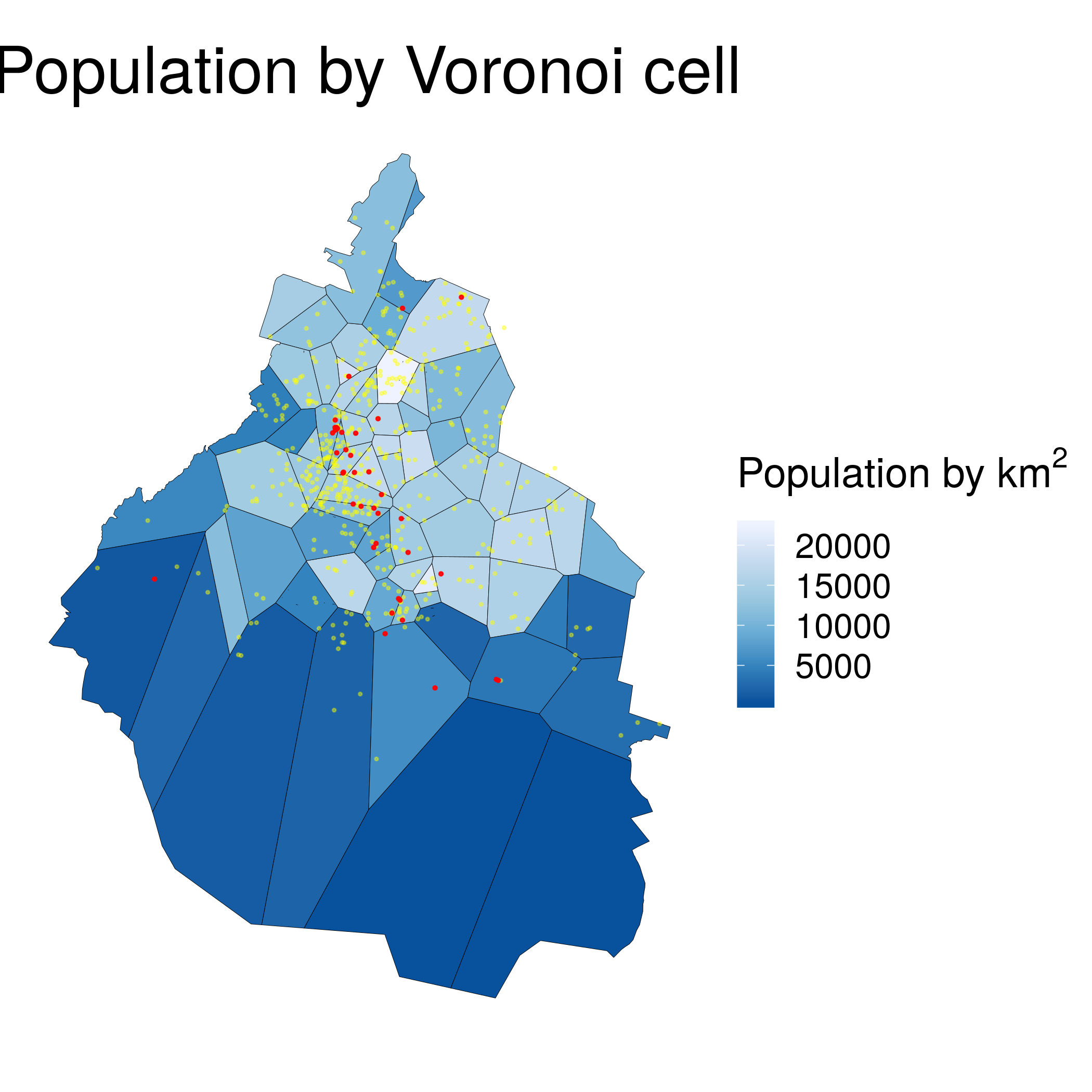
Above we have the resulting diagram where the damaged (yellow) and collapsed (red) buildings are also displayed. Again, each cell represents the are where a certain shelter is the closest. Then we can look at the scaling of the densities (shelter vs population)
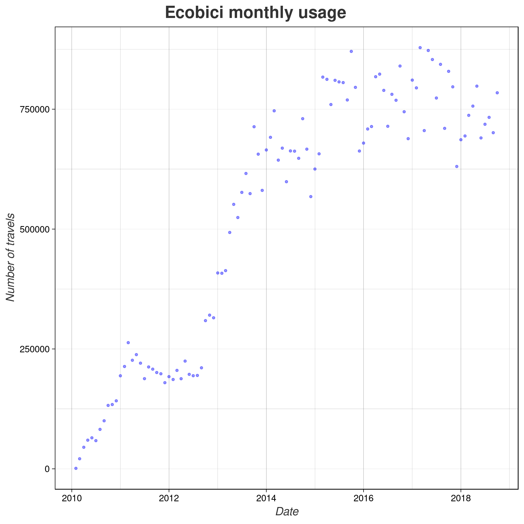
In order to measure the homeostasis of the city I took a look into the mobility given by a bike sharing service (Ecobici) usage patterns which distribution is very biased to certain medium high social class neighberhoods but as we can see in the following image is also where a large amount of damage happenend
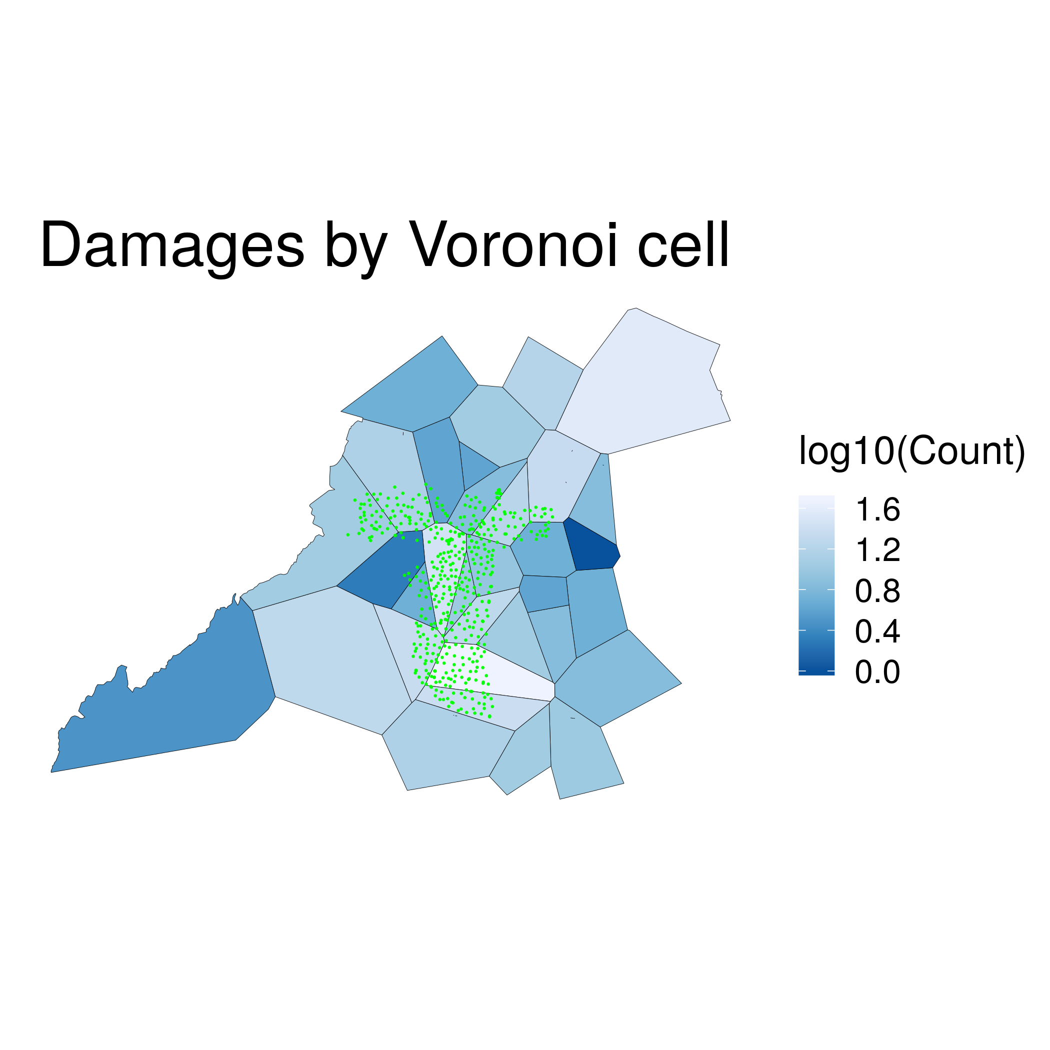
The green dots represents each Ecobici station where bikes should be taken and returned and in this case the Voronoi cells are the are where a certain damaged building is closest. The very first thing to do is to look into the adoption of the service since it was first established. We can take a look at the monthly usage where we can see that it has fastly grown except for a small amount of time near the year of 2012 (elections time).
But that picture doesn’t give enough information to understand how the mobility patterns changed, we need more… maybe looking at specific weekdays
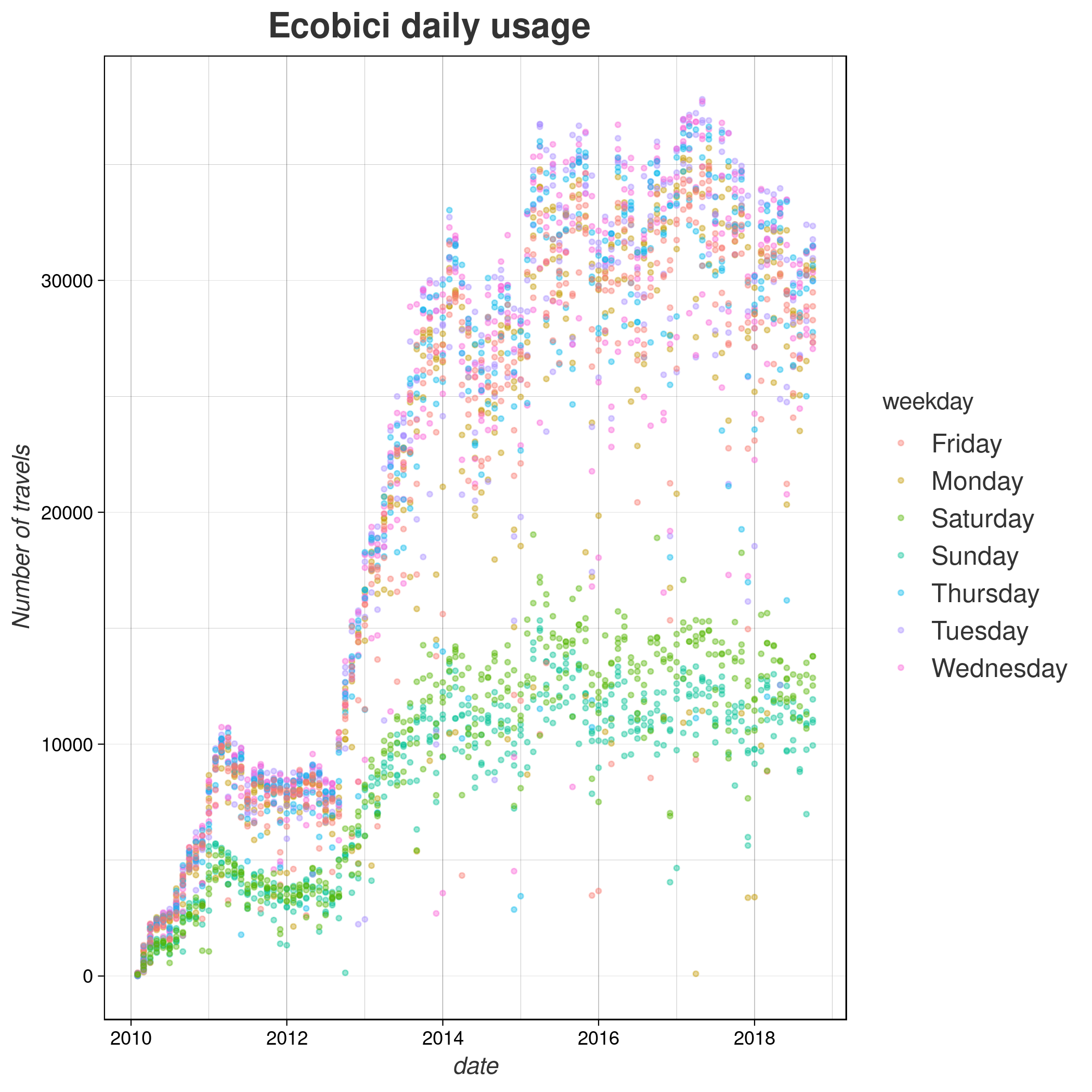
This image really starts to grasp some information such as the fact that the service is being used near to 3 times more during the week days than on the weekends, and you can think that this might be because people uses this to get to their schools and jobs rather than just spreading time. Then we can ask ourselves how would a regular week usage look like, and the closest regular week to the earthquake would be the previous one (we want it to be as close as possible because we want to see how the patterns changed due the earthquake and no external reasons such as new or closed stations, more bikes, etc.).
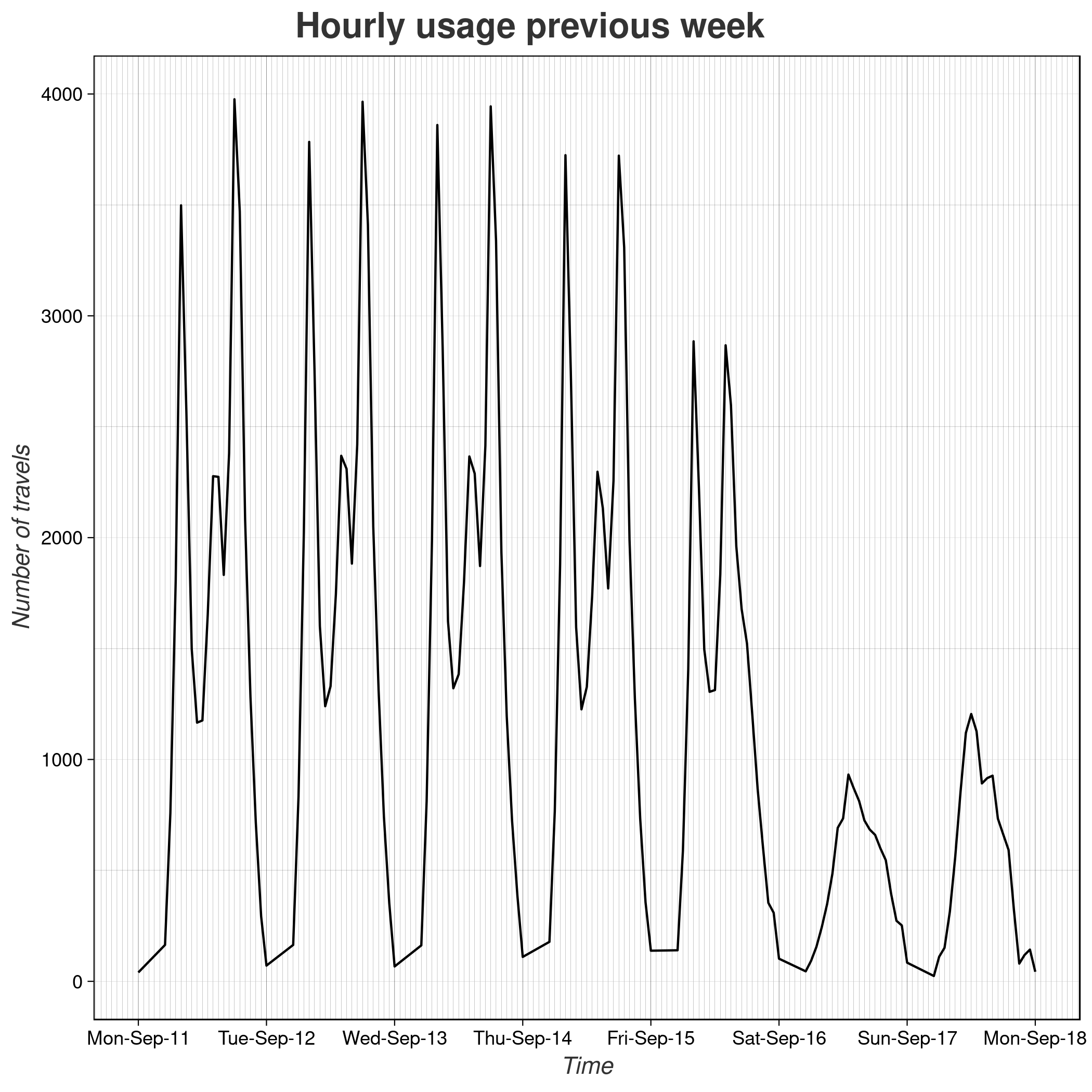
This plot really starts to get interesting as there are clearly three peaks each day where we have a larger usage, a wild guess could be that they belong to the times where people travel to work, then to lunch and when they come back home. There is an issue using this week and that is the fact that the largest celebration in Mexico happened at that time, Independence Day (September 15-16) which means either people got to skip the office/school that day or got an early release and that’s why the Friday’s usage is so different to the other days, with only two peaks. Ok, but then… how does a day look like?
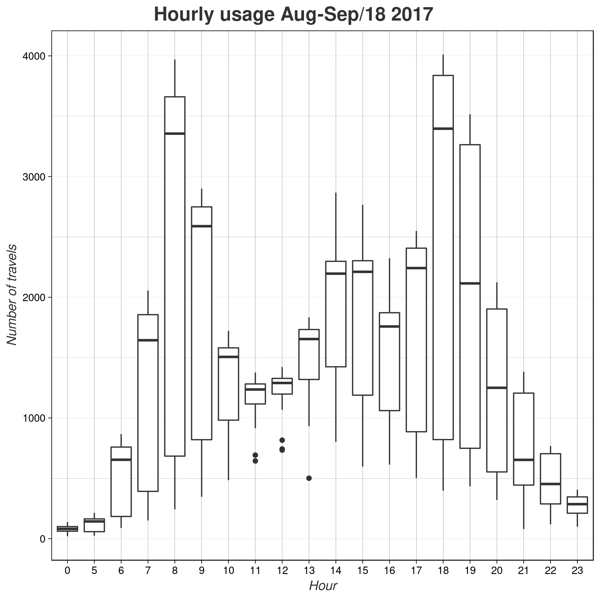
This is the representation of all the hourly travels made during the previous month and a half, this is all August and until September 18th but only for week days. This shows that there’s a time between midnight and 5 a.m. where there’s no service provided and after that it starts to being used with a large amount of travels between 7 and 9 a.m., then again at (Mexican) lunch time around 14-15 hours where also schools end the day, with a large new peak starting at 18 hours. It’s not super clear but the latest peak is the largest one of all three (is clearer if we compare the bars on the sides) and that might be because of a larger number of users returning home by bike or that leaving hours are more shared than arrivals.
What happened on the Earthquake’s week was a large number of drops in usage, some people didn’t have to go to work, schools were closed as well as several streets in those places.
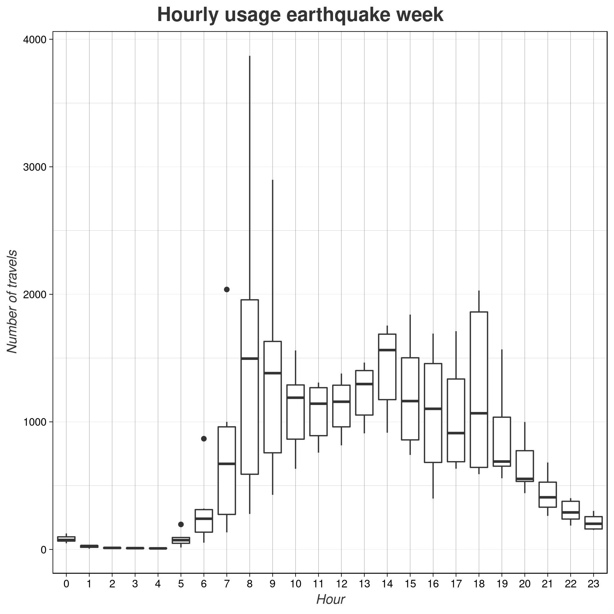
Now we see that there was some usage between midnight and 5 a.m. because the Ecobici service extended the operation hours to a full 24hrs in order to facilitate help where needed for two weeks. The usage was clearly not very normal. Which becomes more evident by looking at the hourly usage of that week.
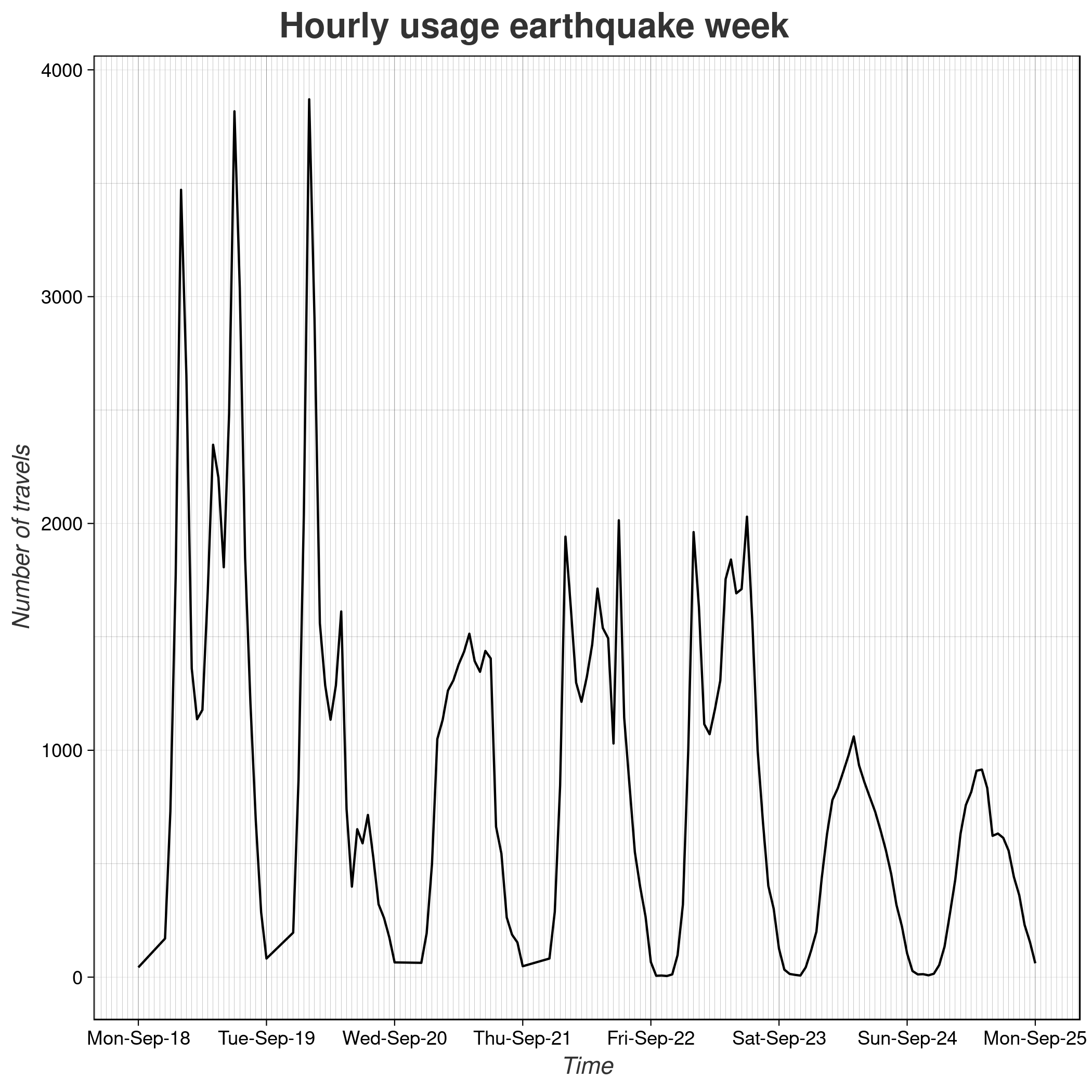
As we can see, Monday was normal but something along 13:14 hrs on Tuesday happend that collapsed the system. Wednesday has a shape more similar to the weekends while on Thursday and Friday we can see that a begining of normal patters were happening but with a much smaller amount of travels. But there has to be a better way to understand and measure the pattern’s change! so what I did was to build a network (what a surprise!) with all the stations and nodes and the number of travels between them as weighted edges, then using a 6 week window previous to the earthquake as a baseline we compute (and normalize) a \(\tau\) Kendall rank correlation coefficient for the edges ranked by their weights between the given baseline and each day’s travel patterns after the earthquake which will be our measure of homeostasis. As Mondays are not the same as Fridays, the baseline and the comparison are for individual weekdays.
The resulting homeostasis measure is
\[H = 1 - \tau\]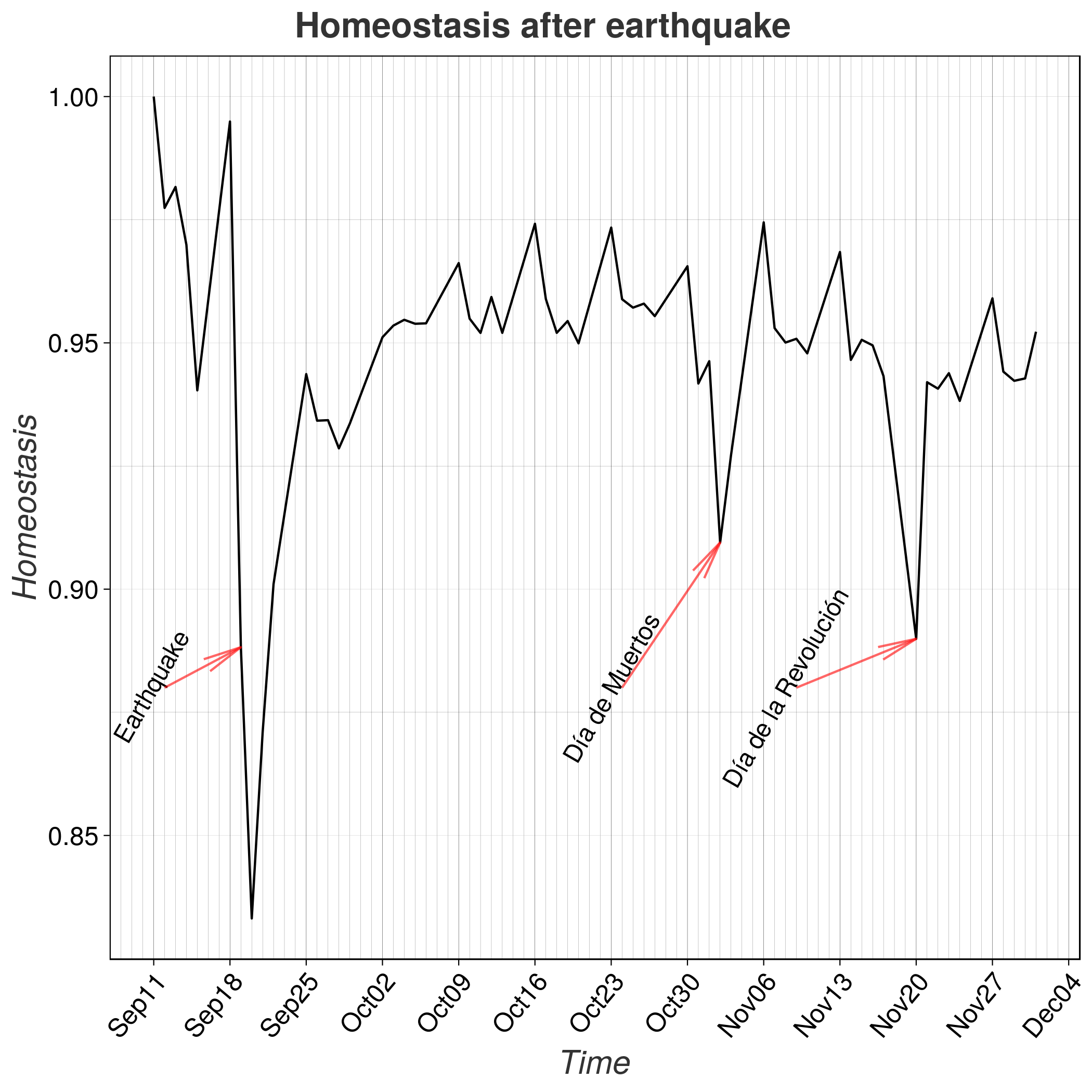
It’s to notice that the earthquake day and the posterior ones have a larger dent in their homeostasis that important hollidays such as Día de Muertos and Día de la Revolución and that somehow it reaches a steady state after only two weeks of the event.
I’m also interested in the morals and social resilience after the event and that’s why I ventured myself into Twitter’s world to asses collective memory by collecting a set of seed hashtags (#FuerzaMexico, #PrayForMexico, #AquiSeNecesita, #AquiNecesitamos, #AquiYaNoNecesitamos, #Verificado19S, #SismoCDMX and #TenemosSismo) and then look at the number of mentions, finding that the event lasted in the collective memory with a consistent decay until the presidential elections and the World Cup, where it lost sight.
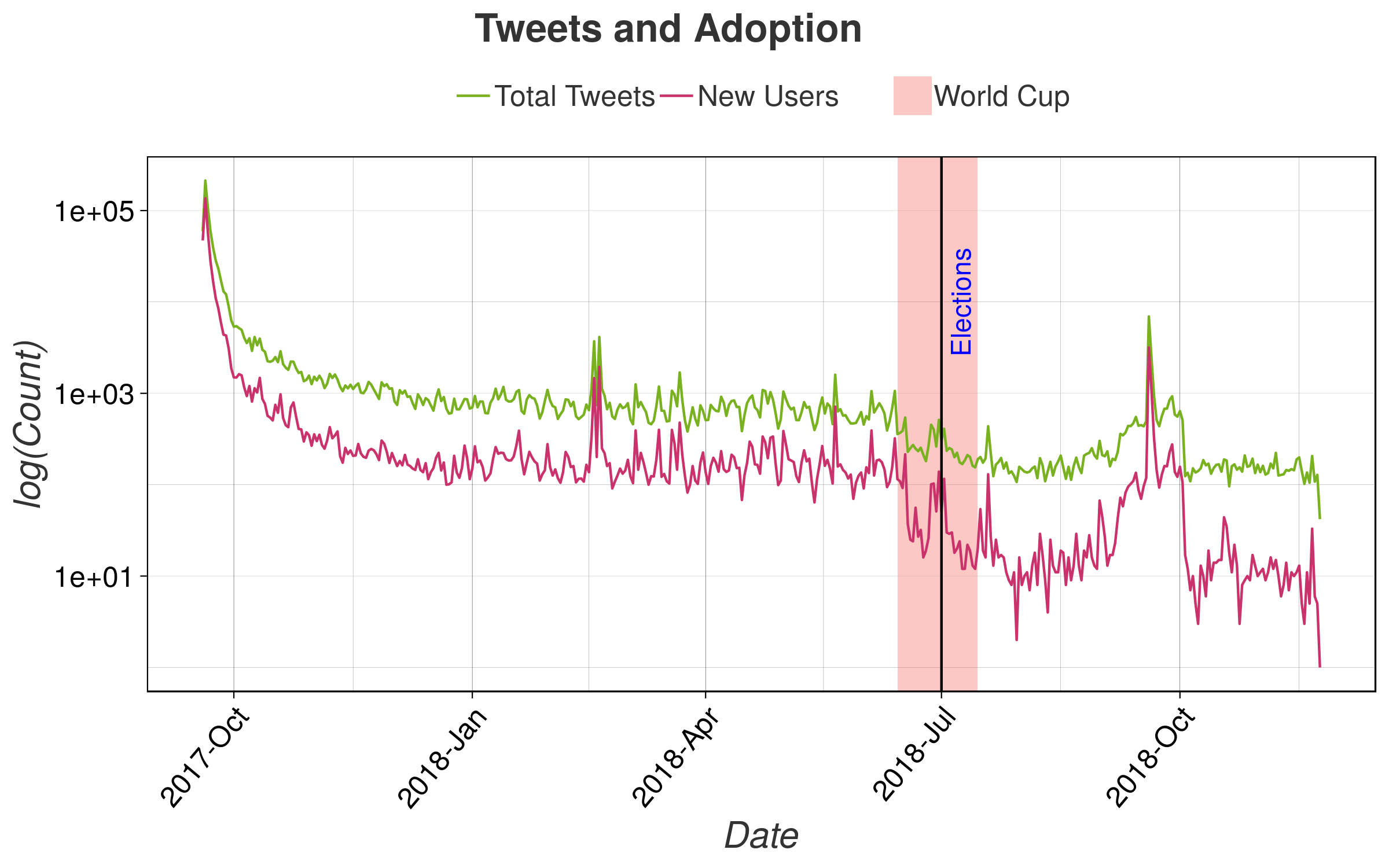
This last plot is very revealing as it shows a sublinear decay of mentions and new adoptions of tweeting about the earthquake until the 2018 World Cup where the attention was focused in a whole different thing. The first peak around February 2018 was a small earthaquake at late hours that got everybody scared, then a little bit mentions were regained around the presidential elections and a large amount of Tweets were written at the first year anniversary.
On a log-log scale, the effect is more dramatical

The collective memory was linearly decreasing until the first 100 days where it plateau’d for 150 days until the World Cup where the decay was super linear. But collective and personal memory are really related, so I wanted to see the number of different days that individual users were tweeting about it, and the span of time between their first and last one.
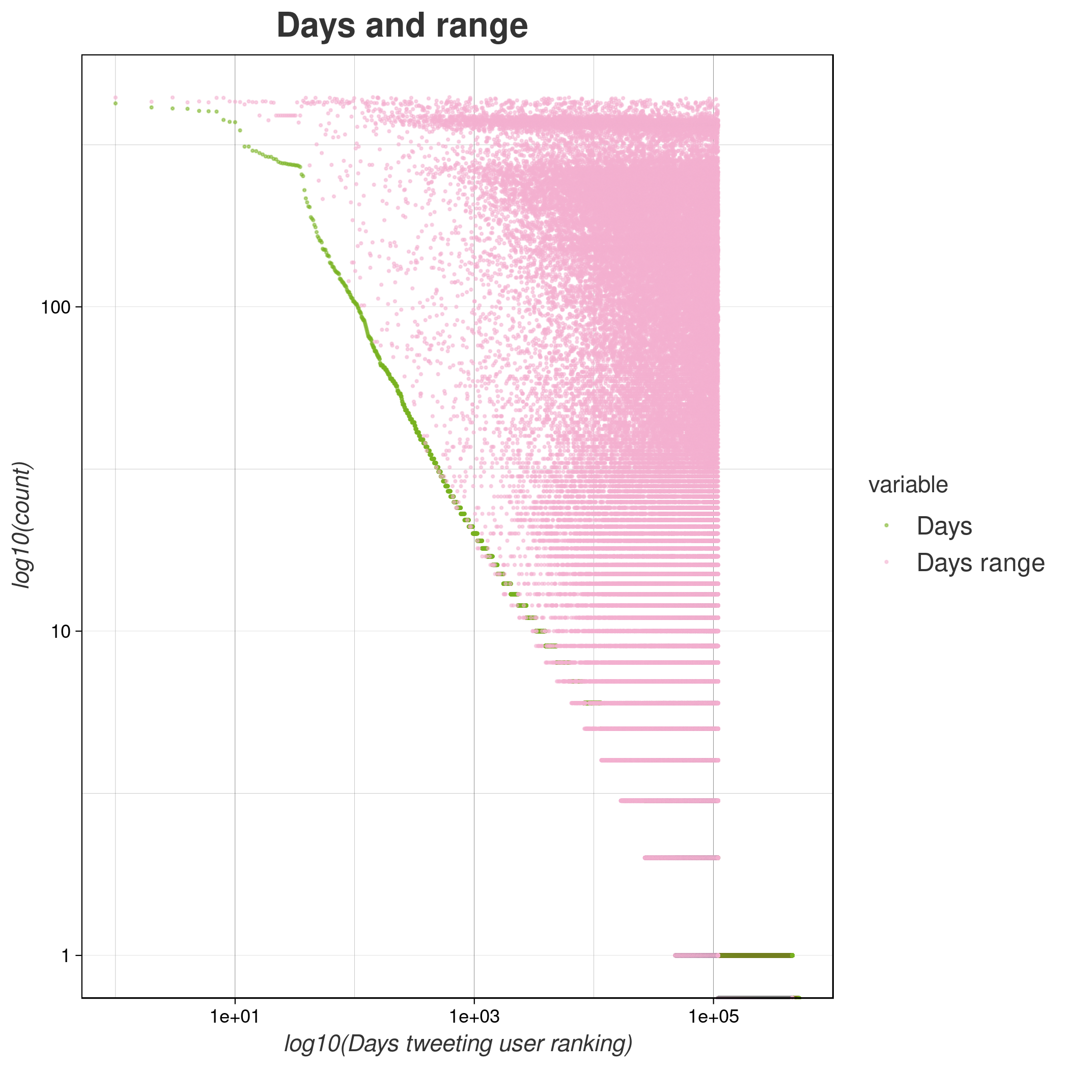
On a log-log scale we see a linear decay on the count vs rank a la Zipf distribution except for the very first places where we can also see a very odd behaviour in the span of days tweeting about it as they tweeted something related everyday, after manual inspection I saw that those were bots and new accounts. On the more interesting part of users, we can see a bimodal distribution on the days range which tells us that the people who tweeted less also did it more sparsely, then there is a regime where people tweeted a buch of days about it but only for the first days and then another large amount of people wrote a lot for several days.
All of this let us see that the need of going to work doesn’t necessarely means that we’re psychologically fine in these types of events, as it was held in the collective memory for almost a year until other very different type of events came along while in two weeks we were forced to being doing our regular things. In the case of the shelter allocation, we can use this type of information in order to incentivize specific locations and relocate bikes at the stations where we can forecast a larger need of taking them or free space to new bikes to arrive.